Branding
Digital Product
USA

In the ever-evolving world of blockchain, NFTs, and cryptocurrency, our team embarked on a branding journey for this project. Tantalis was named after the legendary figure Niobe from Greek mythology and inspired by Niobe from "The Matrix". Tantalis represents more than just an NFT marketplace; it aimed to revolutionize the way digital assets were bought, sold, and experienced. This case study highlights our collaborative efforts and the successful branding of Tantalis.


Dark Blue: Inspired from the Ethereum and the Blue Chip. It is chosen as a primary color; as it refers to security, professionalism, reliable and connection trustworthiness.
Bright Green: This color was used to reflect the support of the "Go Green" environment and the new technology of the NFT; Bright Green is a modern and unique color that refers to growth, safety, and energy.

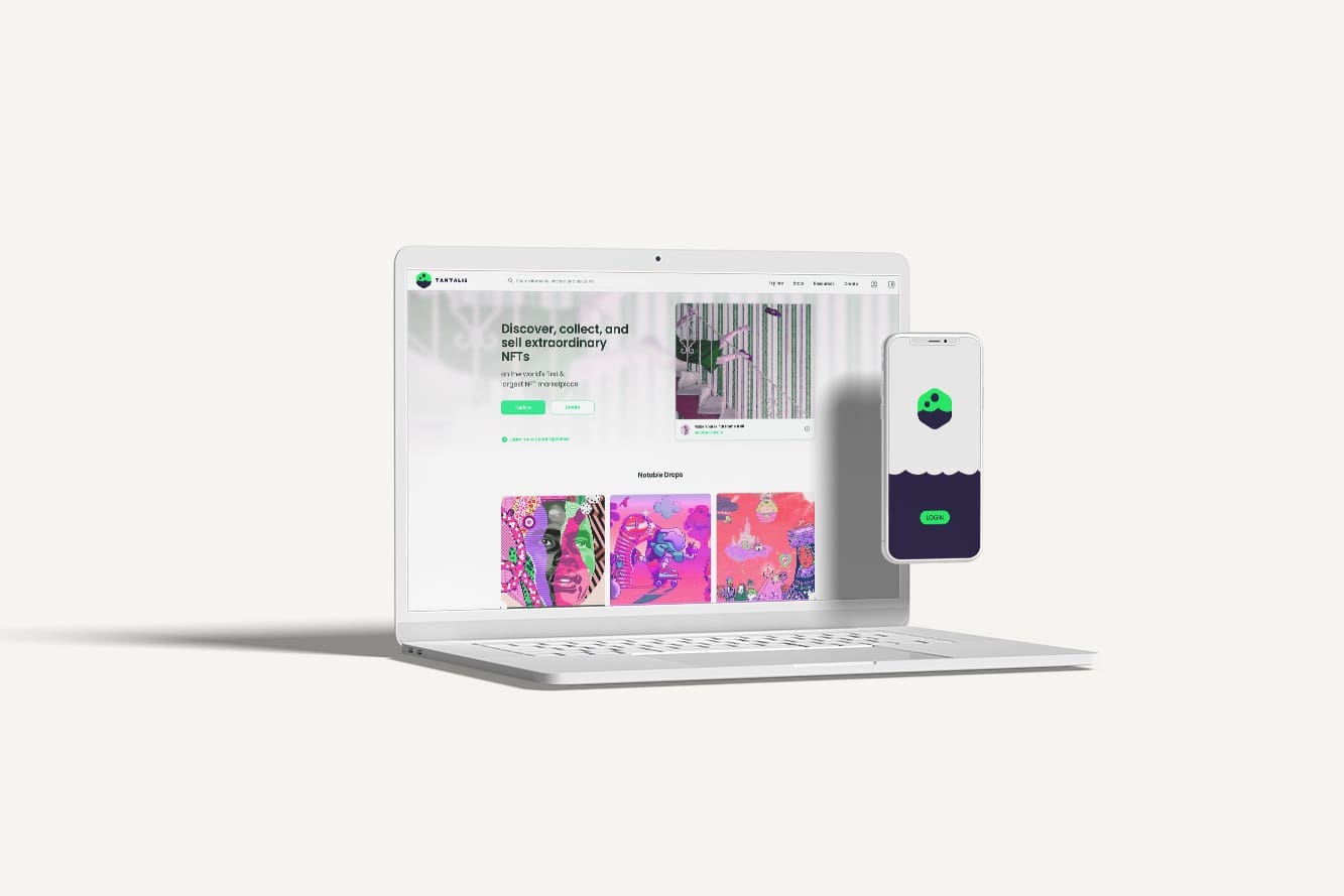
As part of the branding project, we designed Tantalis' website, transforming it into a user-friendly, visually appealing, and highly functional platform. The website served as the digital gateway to the NFT marketplace, enhancing the overall user experience.
In conclusion, beyond conceptualizing a compelling brand identity, our team ensured that Tantalis' digital presence was consistent, engaging, and accessible to users. The redesigned website and branded stationery contributed to a seamless and immersive experience for users, reinforcing Tantalis' position as a leader in the NFT marketplace while maintaining a strong offline presence.

