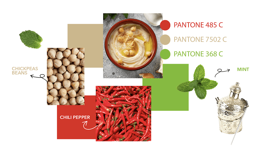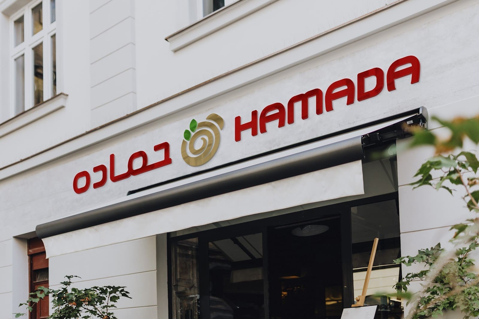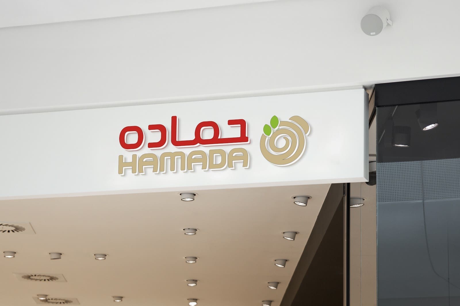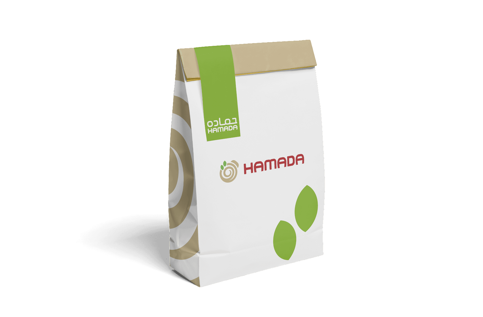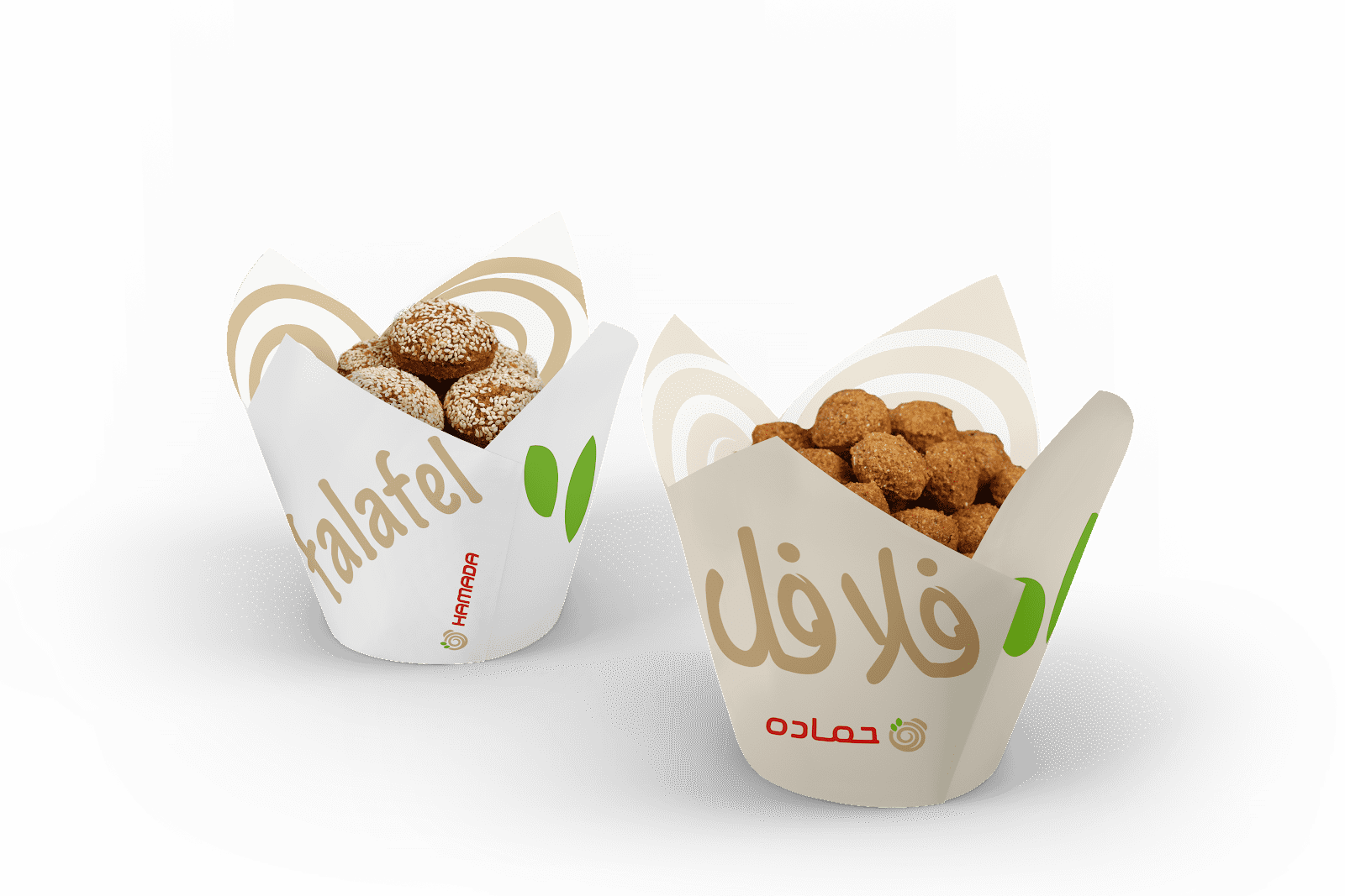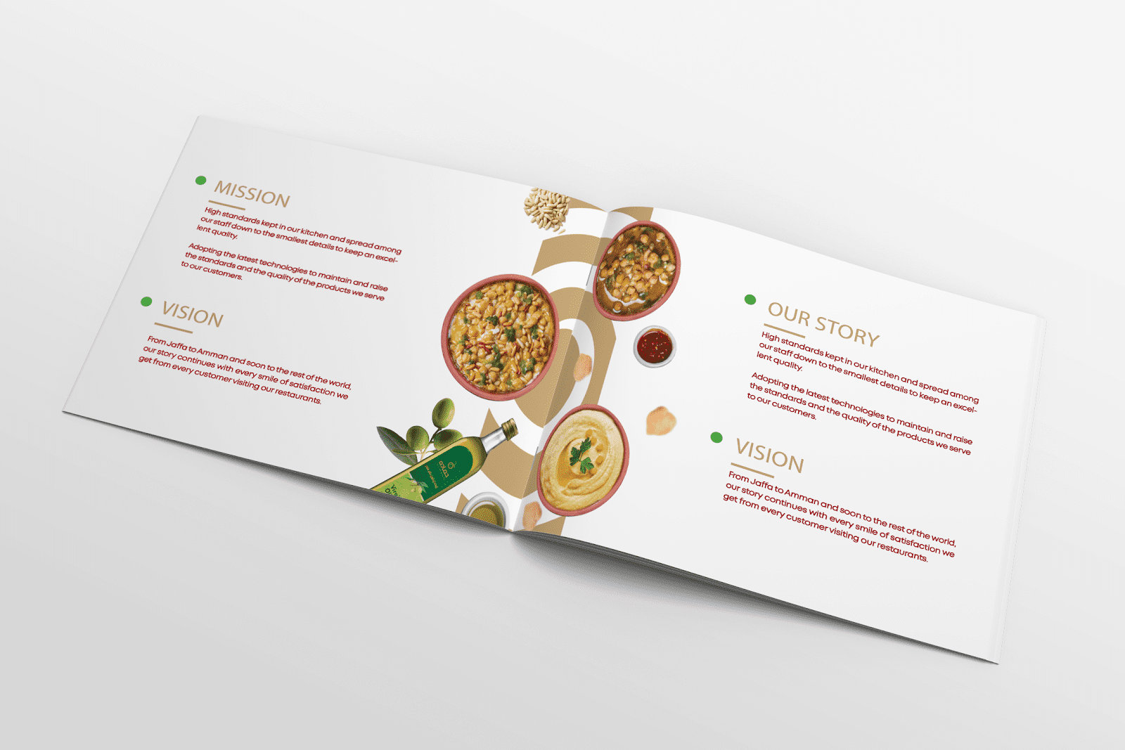
For over 100 years Hamada, has been known to deliver healthy vegan food. The beginning of Hamada’s journey began in Jaffa Palestine and extended to Jordan, giving them the advantage of being able to expand world wide. Hamada specializes in creating exceptional Vegan dishes ranging from Foul to their widely known Falafel recipe, these qualities makes Hamada a great leader in Middle Eastern cuisine. Sergio has acquired a leading position in the food market through processing and exporting wholesome crispy corn chips and roasted corn. The company traces their roots back to 1975 in Syria where the journey has begun. Sergio factory was founded with 2500 m2 space area in Amman- Jordan and a few years later Turksy factory with 3000 m2 space area in Turkey.
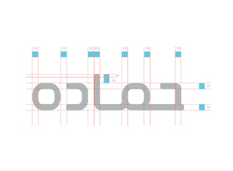
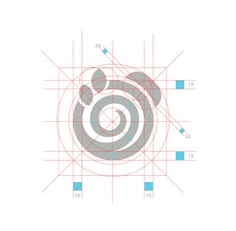
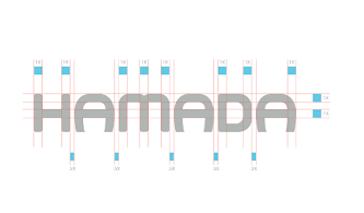
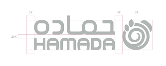
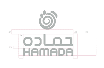
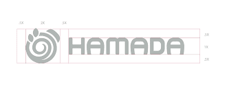
The maintenance of tradition was a challenge faced while conducting the rebranding of Hamada. The owners requested their original branding of Hamada to be conveyed to the new rebranding. The challenge was creating a creative logo whilst holding the same value and meaning of the originally created logo.